Monday, May 7, 2012

Things to come...

At the moment I'm working on a pretty big project, redesigning the album cover to Active Child's You Are All I See. I chose this album because I think it's brilliant, but the cover never really lived up to how amazing the sounds are that he produces:


So here are some developmental images for the direction I'm heading for my redesign. I'm using images to do with blindness, colour blindness and sign language. Different means of communicating. The idea is to make it simple and beautiful, and still have some sort of emotional resonance. 

My initial moodboards:


I've been playing around with a lot of images I've been finding in eighties sign language teaching books:


So here are my initial attempts. Right now it's seeming the final version will have an outer black and white sleeve with braille, and the inner sleeve a burst of colour with the colour blindness tests and sign language imagery all tied together.


x


Got a new camera and went and met my mother in Italy, had a fantastic time and went a bit camera crazy. Was fun though since I haven't done much photography recently due to not having the camera I wanted, but now that I do I took full advantage. 


We did a couple of smaller projects as well... 

Here are some screenshots from a stop motion animation I did, we were assigned one of the biggest companies in the world and had to create a stop motion out of the logo. So my group got IBM, and we decided to have the logo turn into a barcode (since they invented it) and then into a cityscape. So here's some pics till I get the final thing:


And this other project was kind of a fun one at the end of term. We were put into groups of six, and each were assigned a bad typeface that we then had to turn into a mini golf hole. Ambitious and initially very difficult, but the end product was very fun. 

One initial idea.

Second idea, the one we went with. We decided that we had to just go for it on the Egyptian theme, since such a terrible font is cheesy anyway.
Watch the making of here!!


Randoms

Test for title card for friend's film.

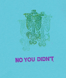
Had a day in class to mess around with rubber stamps, came up with some fun stuff.


After conquering Illustrator, we had another project that relied heavily on using a program I had never used before, After Effects. We were each assigned a famous designer, and we had to create a short animation of sorts that, with typography, visualised a quote of theirs. I luckily got Alexander McQueen, one of my favourite fashion designers, and designers in general.


All of his stuff is very theatrical and quite surreal, so I wanted to get that across in my film. He was pretty quiet, so it was hard to find a good quote by him surprisingly, but I found one that I really really liked and did the best I could do emulate his statement.