This post will be about the first project when I got back, the Shakespeare project. First a nice roast dinner though...
 |
| Lovely roast dinner we had the night I got back. It was nice to be welcomed back with such warmth. :) |
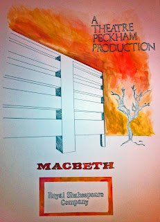
The project was to design a marketing campaign based around a new version of a Shakespeare play of your choice that was being put on by the Royal Shakespeare Company at the theatre closest to where you live. Seeing as I live down the street from Theatre Peckham, that's where my play was to take place. I chose Macbeth because I find the idea interesting, and I thought a modern take on it would be fun.
I took a walk around the area and decided that having the play take place in the area that it was being put on in would be interesting. I live in quite a poor area, filled with estates. I thought it would be interesting to have Macbeth take place in one of these, and have the king be the landlord etc. So I began to play around with this idea...
One of the scenes that interested me the most in Macbeth is when Lady Macbeth is trying to wash her hands of the blood that she has on her hands. I did a photo shoot to try and spark some ideas.
 |
| Set up in my kitchen... |
 |
| Fake blood... |
A product I thought that might be interesting to promote the production would be some soap to reflect the washing of hands, so I made a few of these...
For the posters I decided to do something different than what I had been doing. I hadn't drawn something in a while, something big scale, so I did four massive watercolour and ink posters inspired by lifestyle illustrations of the sixties and seventies...
I made some boxes for the soap to go along with it...
However I went in and talked to my tutor and we decided that although they are aesthetically pleasing to me, they wouldn't reach a wide audience. I wanted to stay in a similar line but create something more colourful and bold. So, back to the drawing board... I did some swatches to try and capture the emotions I wanted to get across...
And below is what I finally came up with. :)
The "x"'s in the posters above were a complete fluke. I had that mark in my sketchbook and it caught my tutor's eye, and he said it almost represented the top of a crown while also saying something about the state of the estates in my area. So I went with it and it became a primary feature in the project.
Just goes to show you the journey a project can take and how one thing can lead to another and so on... It was definitely a learning experience but I was really happy with the outcome.
That's all for now folks!
-Liam xx


