Sunday, December 4, 2011

Project Thirteen: The Shrine Project

The final project of the term was based around a bunch of presentations we had to give about halfway through. We were told to come in and give a little talk on something we were completely passionate about, anything.


One of which was moustaches... But of course I had to do, you guessed it.


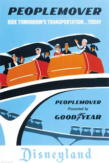
Disneyland. I decided to talk about the reasons it has influenced, how it's the reason I'm in London today, and how it still affects my life. The presentation was well accepted and I was pretty happy about it. Here's a few of the artists I showed that still inspire me to this day...

Mary Blair

John Hench

Attraction posters

So the next part of the brief was that we were to be paired up with someone else's passion and create a "shrine" that paired up both of our interests. I was paired with Georgina, a lovely girl in my class who loves reading. Seeing as both acted as a way of escapism for us, the connection was immediately clear and the ideas started flowing. We had a few ideas, one even inolving very closely considering a trip to Disneyland Paris, but eventually we went onto the idea of books exploding into shapes and Disney characters etc. So we looked to these images for inspiration...


And a trip to the Disney store never hurt...


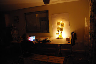
And after all that it was time to start making. We started small and it just grew and grew from there, from paper sculptures to lighting etc. I'll just let the pictures speak for themselves cause there's quite a few!


These were the first tests, and while we loved the outcome we wanted to see what we could do with height and colour, so we decided to go with the idea of an enchanted forest...


Definitely one of my fav things I've done. :) TILL NEXT TIME!!

-Liam xx

Project Twelve: Modernism Manifesto

In between all of the projects this term we've also had various lectures. One series consisting of current working graphic designers and their work, telling how they got to where they are etc. They've been extremely interesting and informative. People such as The Brooklyn BrothersUsed Magazine and others have been greatly informative and encouraging. However, we've also had an entire lecture series on modernism, basically design from the early 1920's through the sixties. Although the lecture series has been far from informative or engaging, the subject is fascinating and we had to find a subject we were interested in and do a 700 word manifesto (essay) and use InDesign to create an A2 poster to display it on. Seeing as I have a fascination in film, I decided to do mine on that. I watched a few modernistic filmmakers such as...

Fritz Lang's Metropolis...


Busby Berkeley...


And Leni Riefenstahl...


All incredible filmmakers. So I did a couple tests...


And eventually ended up with this...


Simple, clear... That's what I wanted. Black and white reflecting the film of the time, three stills that reflect the three filmmakers I focused on. Not much else to say! Till next time...

-Liam

Projects Ten and Eleven: A Dingbat and a Frame

Another one of our projects that has coincided with a workshop is the Zapf Dingbats project. We were all assigned a symbol from the font "Zapf Dingbats" and told to make it out of wood, paint it white, and photograph it somewhere. So, that I did. The shape I got was a spade which made me happy. Such a cool shape and something I felt that I could make an interesting image out of. So I went to the workshop and created the piece, went home and painted it. I wanted it to be relatively big so I could have an impactful image.


Whenever I told someone I was making a spade the first they thought of was something you'd dig up the ground with. In response to this, I thought it would be funny to go into the countryside play around with the idea of spades the shape and spade the shovel. I ended up just fooling around with photography and got some shots I was really happy with.


I think I'm happiest with that second to last one.

Another cool workshop we got to experience was a framing workshop where we got to make our own frame. Twas a useful thing that will come in handy a few times in the years to come I'm sure, and good to know that within the college I can go in and make something that fits my work exactly how I want it to...


That's all folks!

Projects Eight and Nine: Letterpress and a rant on a postcard

Another one of our inductions included going to Old Street in East London to an old letter pressing workshop called New North Press. We got to go in and spend a day there learning about the facilities and do a print based the first line of a novel out of a list that we had to choose from. So, I looked through and one that spoke to me was:

"He was born with a gift of laughter and a sense that the world was mad." - Scaramouche

Letterpress is a tedious process. We were there for eight hours printing out 10 - 20 words each only. You have to handpick the type, do all of the spacing between both characters and words as well as between the lines. It's a long method of printing but a rewarding one. 


And as a little side-note, we had a little project coinciding with us learning about our college's special collection in the library. This is a collection of exhibition catalogues and artist books that are rare and exclusive to Chelsea. However, our assignment was to "rant" about one of the books in the collection on a postcard only using blue pen, so I chose a book called "Cinema" by Albert Mertz. I picked it up as I was intrigued by the title, and then found images such as this.


So, as a reaction, I sent this in:


Ah, art...

-Liam


Projects Three and Four: Piece of paper, Hieroglyphic rapping


So the next couple of projects were quite simple, and were more about working with groups of people than they were about real design. But projects they were nonetheless.

The third project was on taking a large piece of paper, and in three hours somehow getting people to stop in their day and interact with it. This deemed to be a more difficult task than it sounded.

With a group of four very different minded people, we bounced off ideas for a good hour and half. My initial idea was to make a sort of peephole that people could look through on one of the bridges over the river, and then point it at something along the bank that would make people smile or something. However, the group wasn't feeling this and decided to try and go for something quite literal. 


We decided to put huge words displaying LOOK HERE and a giant arrow down to a little piece of writing in pencil that said "Thank You."


However, this turned out to be a mistake. Two big lessons were learned however:

1. Location is such a big part of design and interaction. Had we of gone somewhere with more traffic, our poster would have had more people react to it. Only a few people bothered to look at the poster, let alone go and read what the arrow pointed to.

2. Don't assume the public is stupid or ignorant, they won't react to boring or simple design. What we ended up doing was basic level design, telling the public to do exactly what we wanted them to. Not the right way to approach. 

Ah well, live and learn! It was good to make a mistake though cause that is how you progress and gain knowledge. 

Anywho, the next project was quite silly. It made me second guess myself that I was on a BA course at this point... It was fun nonetheless. We were put into groups and each were given a type of communication. Carrier pigeons, computers, folding paper etc. Our group got hieroglyphics. Through this we were to write and preform a song based on this form of communication. We decided to parody the theme song of Fresh Prince of Bel Air... 

What we didn't know is that the group that got polaroids ALSO decided to parody that song. So in the end we both had a rap battle against each other talking about our respective subjects.

LYRICS:

Now this is a story all about how
The al-pha-bet was used and now
We'd like to take a minute
Just sit right down
We'll tell you how the hieroglyphs were used in Egypt town.

Wait x 2

In ancient Greece was where they were raised
On the playground where Zuess spent most of his days
Evolving, revolving and picture making
When Egyptians came along and decided to take
And a couple of years
To 400 AD
They started using pictures as a language key
To write all over tombs and for biblical scripts
On walls, papyrus and religious crypts. 

They had no vowels so spelling was hard 
And papyrus was not like paper or card
They sometimes used sound but sometimes ideas
In fact they should have discussed it over some beers

2000 symbols, how bad
And we thought 26 was rad
Is this what the language of Egypt was like?
Hmmm, it might be alright.

But wait, there's more to these hieroglyphs 
They didn't use them in their every day tiffs
In fact nobody really spoke or read them at all
They were just used on tombstone walls

Wait x 2

So, it's, really as easy as 'a b c'
Instead it's more like vulture, foot and basket
Their communication skills were really quite bad
But then again, so is this song. 

There's other boring stuff that you should know
Like logographic alphabetic, all that jazz
If anything I can is this stuff is rare
But we thought 'Nah forget it' - 'No one even cares!'

Wait x 1

So thank you for listening and we hope you have learned
How the language of symbolism was earned
You've been a great crowd
We are finally there
To end this rap about Hieroglyphs - yeah.

As ridiculous as it was, it was an interesting and creative way to learn about different ways of communication, and brough the group together quite quickly. As a course of only 55 people, we've all got to know each other quickly, and it's nice to know that I'll be spending the next three years with these people. 


Project Five: The Logo

Our first proper project that we were briefed on as an individual was the logo project. The brief was to produce a logo that reflected our personal design ethos. Preceding this, however, we were put into groups of four and told to come up with ten things in general that we found were important as designers. These were ours:

1. Meet new people, try new things.
2. Don't waste any time.
3. Document all ideas.
4. Be confident, not arrogant.
5. Keep people excited, entertain.
6. Enjoy what you're doing.
7. Leave your comfort zone.
8. Take criticism, learn from it.
9. Less is more.
10. Don't wear Ed Hardy or Paul's Boutique.

Then we assessed what we had found, and were told to create 100 logos that represented the ethos' that spoke to us the most. It was quite the task but it had to be done.


Afterwards we had to pick three of the ones we thought were working the most, and work with others on refining and experimenting with them using different mediums and ideas.

Eventually we were left to take the one which we thought was the strongest and develop it. I chose one that was a big scribble that had the words "it's okay" etched into the sides of it. I liked this one because it was simple, direct, positive, and relatable. I feel very confident in the fact that mistakes are vital, and the only way you can learn is by trying things and if they don't work out then at least you tried it. So then was the time to develop...


I experimented with ink spillage, needle and thread, big marks... I wanted it to look organic but also elegant.


Here's my first submission which I was happy with but not entirely happy. I talked with my tutors and we decided that the type I was using didn't look "flow-y" enough. So back to the drawing board!


After another days worth of work I finally got something I was happy with. I feel that this version is definitely improved and that it clearly gets across my design ethos... 

So yeah! Long project but lots of fun. More to come!

-Liam